User interface design needs to be evidence-based to succeed. While there’s plenty of room for creativity, you have to know that your users will be able to navigate your interface successfully, achieve their goals with your product, and return to use it again. They don’t necessarily have to be ‘delighted’ by it, though that’s a plus. But they do have to be able to use it without experiencing failure or frustration. And you can only know if that’s true by research and testing.
In this post, we’ll pause briefly to define UI, then go on to look at what you need to research and how to go about getting the data you need to make informed UI decisions.
UX or UI?
UX is User eXperience, which is how your users experience using your application. Whether it’s good or not essentially boils down to whether it’s easy and satisfying to fulfill your goals using the app. For example, an online marketplace with a simple, intuitive checkout flow has good UX (and good sales). One that doesn’t is going to lack both.
UI is User Interface, which is the part of your app that your users interact with. This is why the two terms are often conflated: because UI is where UX happens. The interface is where your users experience your product.
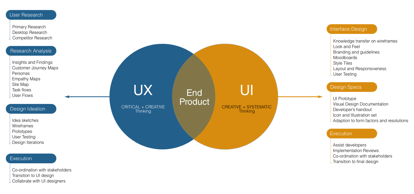
The idea that UX and UI are opposed — that it’s a question of ‘UX vs UI’ — is a myth. In fact, there’s considerable overlap and they exist in one another’s service. But when we’re talking about UX we’re talking about the user’s whole experience. When we talk UI, we’re talking about the part of the product that the user is supposed to interact with. If your product was a car, UX might include miles per gallon and handling on corners; UI would be controls, mirrors and windshield — everything the user touches or sees.
Why base a UI on research?
Few companies’ users are working with their tools the way they expect. Users don’t stay on the paths we build for them. They find their own way to the value they need. Just look at all the crazy ways office staff use basic productivity tools.
What looks clear and simple to the tech-literate people who created the tool might not look comprehensible at all to the end user. They lack your formal, structural view of software, have no clue what’s happening in their computer and rely on ‘it worked last time’ workarounds and walk-throughs. This isn’t just true of older people; the young are experienced at using (highly-intuitive) tech, not at analyzing it, and they don’t understand it either.
Consequently, the only way to gain any real understanding of how your UI functions in the wild is through research. This is crucial to your bottom line, because changing a UI element often means changes to structures and processes too. UI design isn’t just about what color the buttons should be, after all; it’s about facilitating great customer experiences. Changing it is therefore time-consuming and expensive. We should try not to make basic, fundamental alterations if we don’t need to, and we should aim, where possible, to get it ‘right’ the first time. There’s no way to do this when you’re flying blind.
What do you need to know about?
UI research should encompass the following elements:
Text
Text is the carrier of the majority of information, the majority of the time. Imagine this web page, with nothing but the text. Then imagine it with nothing but the images. The images make a big difference in contextualizing and clarifying the text, but it’s the words that do the heavy lifting.
There’s an inverse relationship between how quick something is to read and how quick it is to write. If you can read instructions or copy without thinking, someone else has already thought about it a lot. Draft, test, and critically appraise all the text in your application. In particular, make sure:
- The same tool or menu item always has the same name.
- Everything is as near to common-sense English as possible, with the least possible jargon or complexity.
- Text can still be understood if it’s read carelessly or quickly. If relevant, consider its readability to non-native speakers. It also needs to feel approachable. That means avoiding colloquialisms and highly formal tone.
- Text isn’t just what’s said and how, but how it’s presented. The eye judges before it reads, so typography, density, layout and whitespace are all textual as well as imagerial and structural considerations.
Text is entered by users as well as displayed to them. Check fields — can only valid data types be entered, and can all appropriate data types be entered? Do date fields accept only numerical values? Do search entries automatically resolve to ‘nearest similar’ or leave users fruitlessly searching for absent items or their own typos?
Imagery
Imagery is crucially important. It doesn’t just make text make sense. It imparts information. While the point made earlier, about text doing the heavy lifting, still stands, it’s a partial truth. Imagine this page with only the text in a raw, typewriter-like font; you’d form certain opinions about the site and the company, and click away pretty fast. Most of us don’t think well in purely textual terms, and while visual learners outnumber verbal ones by two to one, almost everyone actually has a hybrid learning style that requires multiple types of input. That means we have to research which images, image types, and image-text combinations are most effective for your audience.
In particular, look to competitors and try to go a layer deeper: the tendency to copy other brands’ visual style is strong, which is why every time you look around, startup websites and tech companies tend to look totally different from five years ago and all the same as each other. Instead, try to figure out how to imitate their success.
Structure
Visual structure is a critical UI consideration. It has to mirror the underlying structure of the product in such a way that the user has an instinctive feel for what’s happening, where they are in the process, and most importantly, what to do next to get what they want. It also has to be appealing, and accord with users’ expectations.
UI structure decisions involve structuring decision trees and flows, but the function of on-page elements in these processes must not be underestimated. Visual hierarchies of size, position and color inform the user’s eye about what to expect, what to do, and what matters.
This layout is clear and easy to understand and use. It got that way by extensive user testing.
While there’s an increasingly large body of evidence-based best practice, your own data is always the most valuable.
Research is important. Hopefully, by now you’re convinced. How should we go about it?
Let other people do the work
Don’t reinvent the wheel. In the sciences, this is called a ‘literature review’ — look at what’s already been written and which reports have already addressed your problems. Check them for quality and bias and see if they can be applied to your situation. There’s a huge volume of extant, evidence-based best practice that can be applied to your situation if you don’t have any data of your own. However, it’s not without its problems.
Existing best practices are widely known, leading to a tendency toward similarity that can make your product unmemorable or excessively familiar to users, as if it’s ‘nothing new.’ At the same time, users have developed their own expectations of structure, layout, function and appearance largely on the basis of these best practices, so violating them without consideration can leave users feeling baffled, lost or repulsed.
Obviously, the best solution for most companies is to ‘buy off the peg, then tailor to fit.’ Recruit best practices to match your specific needs, user base, features, structures and processes.
This partly depends on how much of your own data you have. If you’re a startup building your MVP you won’t have any of your own data. You’ll have to fall back on best practices and research from lookalikes (including the competition). If you’re established and building a new feature or product you can use some of your data, some from competitors.
Test it on your users
Where possible, conduct user tests on actual or prospective users. Offer signups on your website (or app) before the product and its UI are built, test elements on those signups in return for membership when the product is built. Use their responses to tailor the product and iron out kinks and errors.
Don’t just ask users for their feedback, though that’s important. Seek quantitative results by offering multiple-choice tests. Test imagery and structure using ‘blur’ tests that blur out detail, letting users respond to the gestalt of the page rather than individual elements.
This is a special case of the ‘user is drunk’ concept, though you should probably use tests like these rather than defer to this noble soul who promises to test the notion against the ultimate standard.
Test text using the Cloze test, which removes words from text to see if the remainder is still comprehensible (you can create your own Cloze tests here); again, we’re testing the gestalt understandability of the page.
You should also test tasks, starting with the most mission-critical ones. For a tool designed to control multiple IoT environmental control units from a single mobile endpoint, mission-critical tasks include the ability to securely connect to a new device. For an ecommerce page, checkout flow is mission-critical and should be tested thoroughly, repeatedly, and first. For any app, installation and logon are mission-critical because they’re dependencies; you can’t do anything with a tool you can’t pick up, however good it is at everything else.
Watch
Watch test users if you can. They’re subject to a slew of biases that make their feedback unreliable. In particular, they often seek to avoid conflict, including telling you negative things about an app you clearly care about. They typically want to present themselves as self-sufficient and competent, which means not admitting when they’re lost or confused. And our memories aren’t always reliable either. Looking over users’ shoulders, via screen-recording and mouse movement recording tools like Crazy Egg and Hotjar, gives you information that users can’t give you themselves.
You’ll get to watch first-hand as users confuse action elements like buttons with static imagery, wave the cursor around elements they’re considering clicking, or get lost in flows that seem simple to you and your team.
Ask
Numbers are great. But personal conversations with users will tell you things about your product that you’ll never find out any other way, especially if you create the space for them to be honest, critical, and open-ended. Then users feel comfortable telling you things you don’t want to hear, like, ‘Oh yeah, all my staff say they hate the way that feature is three menus down.’ That’s a genuine actionable insight.
Test it yourself
You don’t need users to test some elements of your UI. Test interactive elements for speed. Speed is one of the most important elements of a web app, and poor response speed has similar effects to poor initial load speed: users get bored and open a new tab, look away, lose interest. Their frustration becomes your churn.
Holistic testing and research
These methods shouldn’t be used separately. They should be elements in a strategy. The insights gained from user testing and screen recording should inform surveys. The qualitative data you get from conversations should tell you what to test. The research on competitors and best practices should tell you where to start, your own data should guide you to the changes you need to make. The result should be a simple, intuitive UI that your customers can use to achieve their goals easily, while feeling in control.
How AndPlus can help
At AndPlus, we’ve developed easily-useable interfaces for hundreds of projects, including web and mobile apps for businesses across industrial transportation, logistics, and many others. Some had to do one thing well, others were a gateway to wide-ranging, complex functionality. All had to appeal to end users, not place obstacles in the path of their action or understanding.
We know how to research and study your space and your competitors; how to build an MVP that showcases your brand and your abilities, or to work up the UI you have into something users delight in. We get that it’s more than just a paint job and we know how to assemble the million points of user data, research and testing feedback into something you can count on. When it makes sense to build on best practices, we know where to start; when it’s time to tailor, we know where to cut; and when you need to start from first principles, we’re not fazed. We’ve helped businesses open the door to their product, growing user numbers and user satisfaction, revenue and profitability.
Takeaways:
- Don’t reinvent the wheel. Get all the freebie research you can from competitors and already-existing research before you start.
- Remember to test all the elements of your UI, as well as how they work together
- You don’t need users to test some elements, like response speed.
- Get both qualitative and quantitative data: proffer surveys and ask questions, take screen recordings and have conversations. It all helps.
- If you don’t want to start from scratch, work with an experienced partner.